Black, white, and one light
NorthBlue is a monochrome brand. The logo is black or white and nothing else. The blue in the name is a light, not a paint — it appears only as refraction inside a glass material — two motifs, each rendered for black and for white — on the large surfaces where that light has room to move. This page is the whole system: what the company is, how it speaks, and how the mark, the colour and the glass are used. For how the logo is constructed, see How the lockup is built.
01What NorthBlue is
A hotel puts a QR code at the front desk. A guest scans it and gets the city — the experiences worth booking, a concierge that answers, and soon the hotel's own menu of late checkouts and champagne to the room — on a page that carries the hotel's name, with nothing to download. The hotel earns on every booking. NorthBlue is the channel between check-in and check-out.
Who it is for
Independent and boutique hotels, starting in San Francisco, and the local operators whose experiences they carry. The buyer is a general manager or owner. They think in occupancy, revenue per guest, and how many questions the desk answers a day.
Who it is not for
Travellers directly. NorthBlue is never positioned as a guest app, a travel marketplace, or something a person downloads before a trip. The guest meets it through the hotel, in the hotel, and that is the only door. This identity is the company's, pitched at the people who buy it; a warmer guest-facing expression can come later, and will be a layer on top of this, not a replacement.
The category word is commerce, not intelligence. What NorthBlue does today is sell — the city's experiences and the hotel's upsells — through a channel the hotel owns. "Hotel intelligence" already means revenue management to the buyer, and claims a product that does not exist yet. The intelligence story is earned later, from booking data no one else has: what a hotel's guests actually do in the city. Sell the transactions first.
02How we speak
Hotel trade, not consumer tech. Plain sentences a general manager would say across a desk. Confident without being loud. We describe what happens, not what we are.
Do
- Say hotel early. The buyer should know in one sentence that this is for them.
- Name the guest's moment: during the stay, at the desk, from the room.
- Talk about what the desk stops answering and what the hotel starts earning.
- Use the hotel's own words: concierge, front desk, in-house, upsell.
- Prefer the specific. "Late checkout, a table at eight, the ferry to Sausalito" beats "curated local experiences".
Don't
- "App." There is nothing to download. The word makes a GM think of adoption problems they already have.
- "AI", "intelligence", "smart". The concierge is a feature. Leading with the mechanism reads as a startup pitch, not a hotel product.
- Travel vocabulary. Journeys, destinations, wanderlust, discover the world. That is an airline or an OTA. We are inside the hotel.
- Claims we have not earned. No "live with hotels across San Francisco" until it is true. No logos of companies that only supply an API.
- Exclamation marks. Emoji in anything a hotel will read.
03The logo
One lockup: the stacked wordmark, "north" over "blue", with the navigation mark set after the "e". It is black on light surfaces and white on dark ones, and those are its only two states. There is no coloured version.
When to use the mark alone
Below about 100 px wide the wordmark's counters start to fill in, and the lockup stops reading. Switch to the mark on its own: favicons, app icons, social avatars at small sizes, a stamp in a corner. The mark never appears alone on a surface where the name is not already present somewhere.
What the mark is
A navigation cursor — the arrow a map shows for you are here, facing this way. It is not a paper plane and not a compass needle. It points up and to the right, always. Rotating it changes its meaning.
Clearspace
Keep a clear field around the lockup of at least the mark's own width on every side — roughly a quarter of the wordmark's width. Nothing sits inside that field: no text, no other logos, no edge of a photograph, no glass.
Inside a square
A stacked lockup centred in a square looks dropped — the mark's overhang pulls the eye right and the whole thing reads low. The placement study measured a hundred positions and settled on ink width 86%, left 5.5%, bottom 17%: deliberately left-biased and slightly low, which reads as composed rather than accidental. The true-centre alternative is W 86% / L 7% / B 25.4%. Use the same composition on black and white masters, and never add borders, dots, a second mark or copy inside the square.
Never typeset the name. The wordmark is outlined artwork, not a font, and its weight is synthetic — there is no typeface that produces it. Always place the SVG. In running text the company is written NorthBlue, one word, capital N and B.
04Colour
Two colours and a light. Black and white do all the work. Blue is never a fill, a button, a heading, a border, or a background — it exists only as refraction inside the glass material, where it reads as light passing through something rather than as a colour that was chosen.
The test for any surface: take the glass away. If what remains is not clearly a black-and-white brand, the blue has been used as a colour instead of as a light, and it is wrong.
05The glass
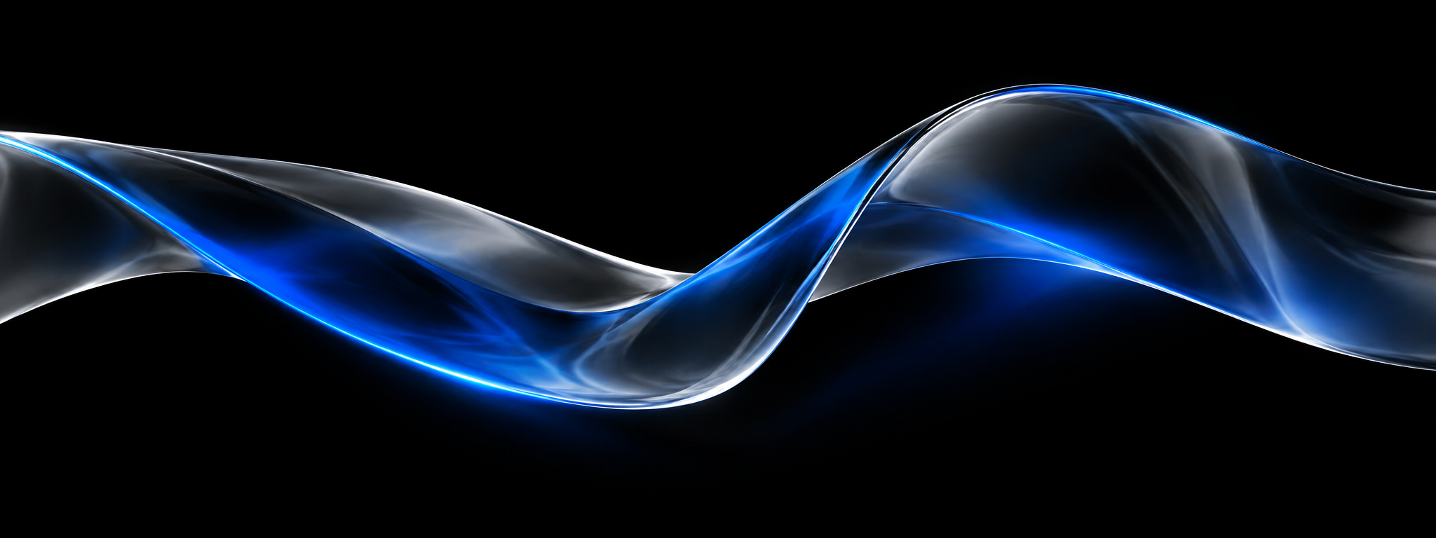
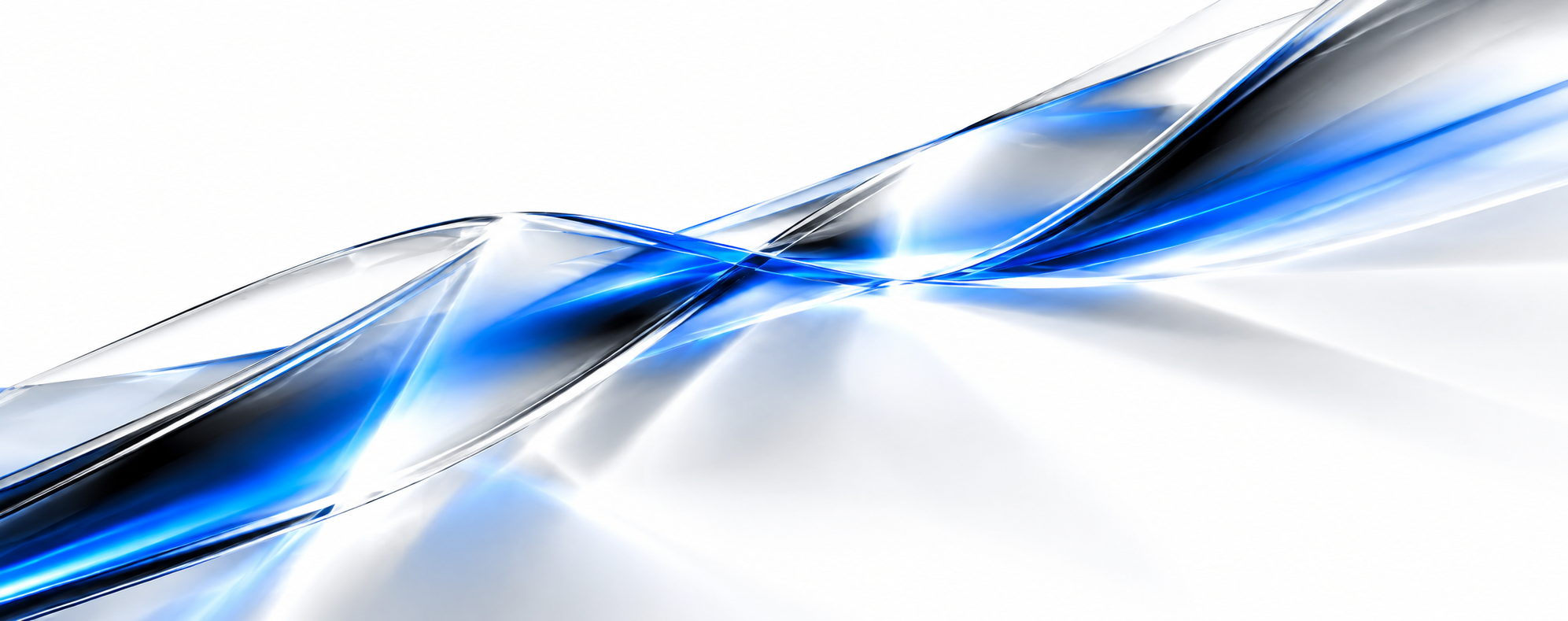
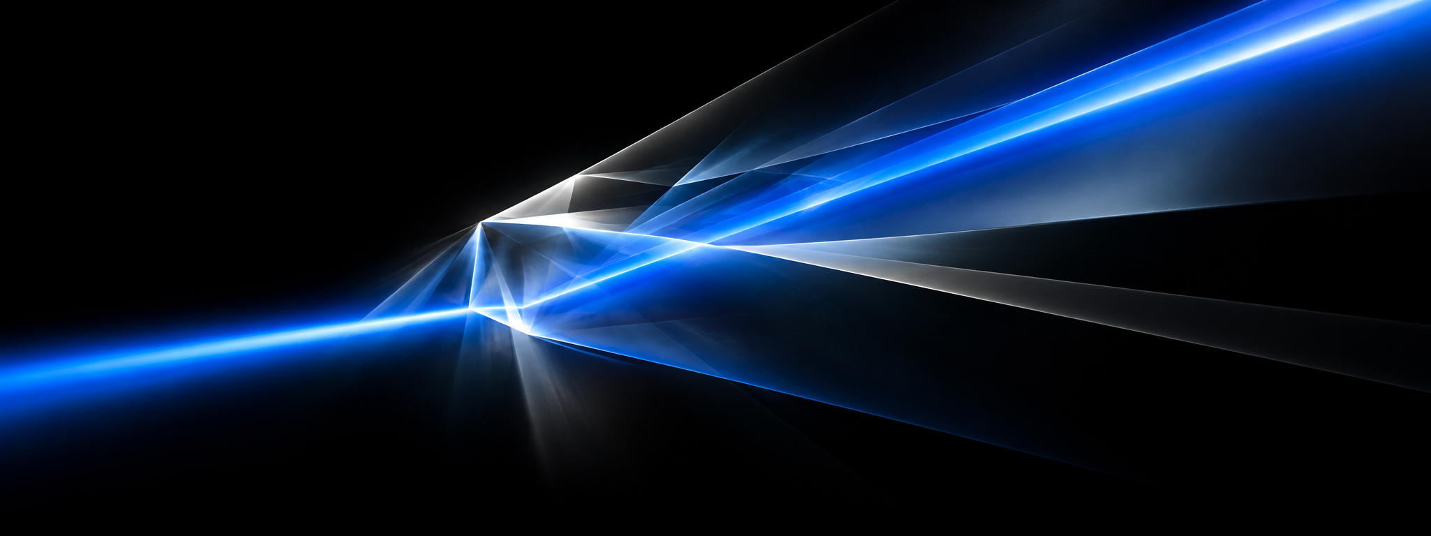
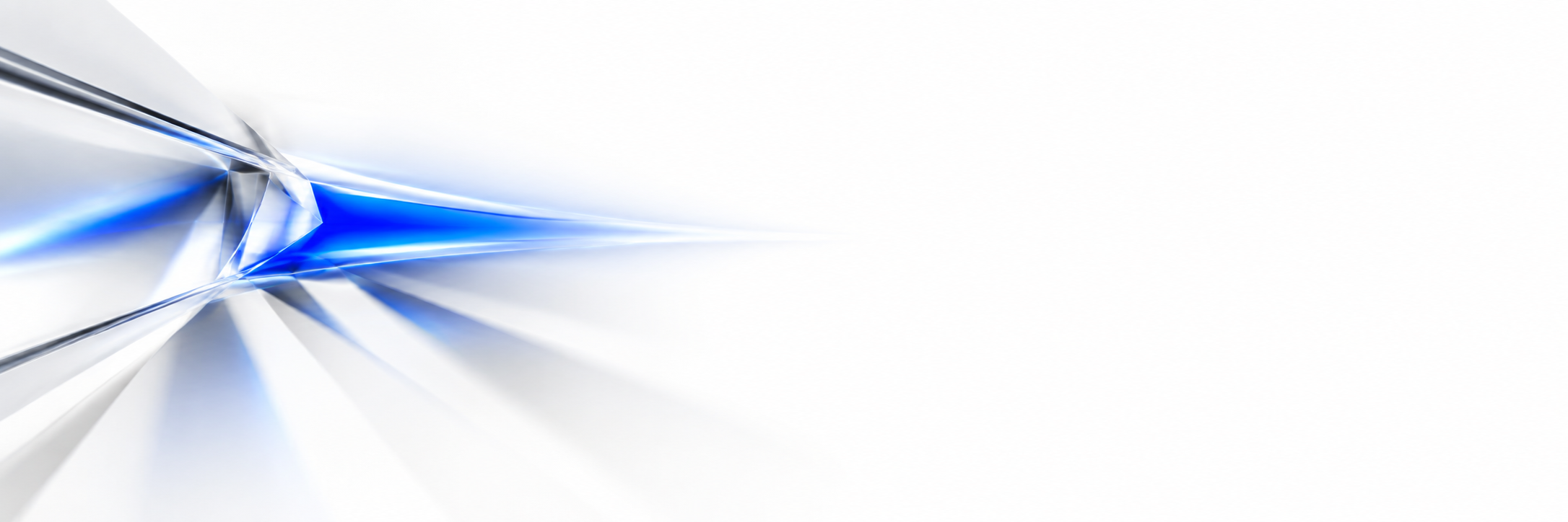
Clear glass with light moving through it. This is the one expressive element in the identity and it carries all the colour the brand is allowed. There are two motifs and each is rendered for two grounds — four images, one material. Pick by surface, never mix grounds, never put anything on top of the light.
The wave
A sheet of glass caught mid-motion. Ambient — it says material and calm. Use it where the brand is the backdrop to something else: the LinkedIn banner, a cover, the ground behind a quote. It reads from any distance and never asks for attention.
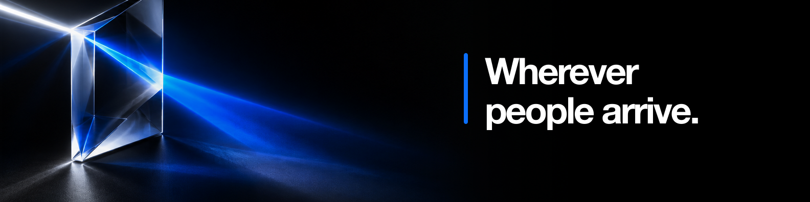
The beam
One band of light entering the glass and fanning out. Directional — it points, the way the mark points. Use it for moments of arrival and launch: the landing hero, an announcement, the first slide. Compose so the beam travels toward the quiet field where the type sits, never away from it.
Where it lives
- Wide surfaces: banners and covers, the landing hero, launch and announcement imagery, deck title slides, the top of a long email.
- Always with a quiet field left for the mark or a line of type. The light occupies part of the frame, not all of it.
- On its own ground. The black renders on black, the white renders on white. Never a black render over a white page or the reverse — the edges show and the material dies.
- Rendered, not drawn. Photographic quality, believable optics. Generated from a prompt, then treated as a photograph.
Where it never goes
- Inside the logo. The mark is flat. A glass-filled mark is a render, not a logo, and dies the moment it is printed or embroidered.
- Behind text. Nothing anyone reads is set on the light. Type sits in the quiet field beside it.
- In the product. The app is monochrome. No glass in headers, cards, buttons, or empty states.
- On anything under about 600 px wide. Avatars, favicons, tent cards, email footers. At that size the light is noise.
- Cropped to a sliver. If the surface only has room for a strip of it, it has no room for it.
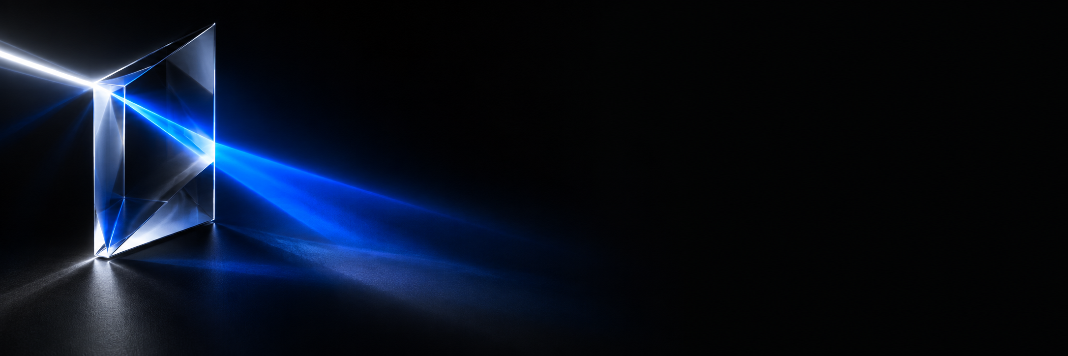
The prism itself
A fifth render shows the object — a real glass prism with the beam entering it — on black. It is the source of the metaphor rather than a surface to build on: keep it for a "how we think" slide, an about page, a moment where the material is the subject. It is not a banner.
Making a new one
Generate with the existing four as the style reference. The prompt below is the shape that has worked; swap wave for beam and black for white as needed, keep everything else.
A single sheet of clear glass caught mid-motion, sweeping across a pure black background.
The glass refracts one band of deep electric blue light with silver and white highlights along
its edges. No other colour anywhere. Photorealistic, believable optics and caustics, shallow
depth. The glass occupies the right two thirds of the frame; the left third is empty black.
No text, no letters, no logos, no objects, no reflections of a room.
Reject any result where the blue reads as a flat gradient rather than light through a material, where there is a second hue, or where the glass fills the frame with nowhere quiet to put the mark.
06Type
The wordmark is outlined artwork and needs no font. Everything else is set in Inter, which is what the product already uses. One family, weight for hierarchy, and tight tracking on anything large.
Rules
- Two weights are enough: 600 for anything that leads, 400 for anything that is read.
- Tracking tightens as size grows. Body is untouched; headlines sit at −0.03em.
- Sentence case everywhere. No title case, no all-caps headlines. Small caps with tracking are for labels only.
- Numbers that line up use tabular figures.
What the wordmark is not
It is a geometric sans, close in spirit to Poppins, but it is not Poppins and no font reproduces it — the weight sits between the source family's Medium and Bold and was synthesised. Never approximate the wordmark with type. If a surface cannot take an SVG, it takes a PNG of the SVG.
07Where it shows up
The same few decisions applied to real surfaces. Each of these is either black with the logo in white, or white with the logo in black. The glass appears in exactly one of them.
08The site icon
The favicon is the mark on a black tile, and it adapts: white mark on a black tile in a light browser, the bare white mark in a dark one. Below, every variant that was considered re-renders into real browser chrome at true pixel size, with each browser's actual rules applied. Safari 26 reads the SVG but ignores its dark-mode query; Safari ≤ 18 never sees the SVG and takes the ICO. Those two facts are what make the tile the right answer.
Chrome · Edge SVGdark query
- SVG favicons since Chrome 80 / Edge 80. The tab strip draws it at 16 px; bookmarks and history use it too.
- Honours
prefers-color-schemeinside the SVG — the file re-evaluates when the OS theme flips. This is what the adaptive variant uses. - Android ignores the favicon for Add to Home Screen and uses
manifest.jsonicons instead. A maskable icon keeps its content inside the inner 80% circle. theme-colortints the Android address bar. Desktop ignores it.
Safari · macOS SVG from 26no dark query
- SVG favicons only since Safari 26.0 (September 2025). Everything up to 18.7 ignores the SVG and takes
favicon.ico. That fallback is load-bearing for the next year or two. - Ignores media queries inside the SVG, even in 26. Whatever the SVG's base state is, that's what Safari shows on both light and dark tab bars.
- Pinned tabs use the regular favicon since Safari 12.
mask-iconis legacy and not needed. theme-colortints the whole tab bar since Safari 15, and supports light/dark media. macOS rejects colours that would hide the traffic lights.- Website icons in tabs are on by default since Safari 14.
Safari · iOS raster home icon
- Home screen wants
apple-touch-icon.png, 180 × 180, square and full-bleed. iOS applies its own corner mask. Transparency is flattened to black. - Tab favicons follow the macOS rules: SVG from iOS 26, ICO before that.
theme-colortints the top of the browser in iOS 15+.
Firefox SVGdark query
- SVG favicons since Firefox 41 — the earliest of the four — and it honours the dark-mode query.
- Shows the icon in tabs, the address bar dropdown and bookmarks, all at 16 px.
- Ignores
theme-coloron desktop.
Google Search SVG ok
- Square, at least 8 px; Google recommends 48 px or larger and re-samples down. SVG is accepted.
- It draws the favicon inside a light-grey circle next to the site name — so a black tile becomes a black disc with a white mark, and a bare mark becomes a small glyph on grey.
- Takes the icon from the site root; changes can take days to re-crawl.
Windows · misc
msapplication-TileColoris honoured by Edge's Start-menu pin. It's set to black.- Edge, Brave, Arc, Vivaldi, Opera all run Chrome's engine and behave like Chrome above.
| Browser | SVG favicon | Dark query in SVG | What ours falls back to |
|---|---|---|---|
| Chrome 80+ · Edge 80+ | yes | yes | — |
| Firefox 41+ | yes | yes | — |
| Safari 26+ · iOS 26+ | yes | no | SVG in its base state |
| Safari ≤ 18.7 · iOS ≤ 18.7 | no | — | favicon.ico 16/32/48 |
| Samsung Internet 13+ | yes | yes | — |
| Google Search | yes | n/a | rasterised in a circle |
Global SVG-favicon coverage is about 92%. The missing 8% is almost entirely Safari that hasn't reached 26 — which on a Mac is a hotel GM's browser.
09Don't
Most of these have happened at least once already. Each one breaks something specific.
blue
10Files
Everything lives in public/brand/. The six SVGs are generated — edit the knobs in build-brand.py, never the files — and the construction is documented in How the lockup is built.
| File | What it is |
|---|---|
| northblue-wordmark.svg | Full lockup, black. The canonical file. |
| northblue-wordmark-white.svg | Full lockup, white. For black surfaces. |
| northblue-wordmark-current.svg | Fill is currentColor. Inline it in the product and let it inherit. |
| northblue-mark.svg · -white · -current | The mark alone, same three fills, cropped to its ink. |
| northblue-linkedin-logo.svg / .png | The company avatar: white lockup on black, 400 × 400. |
| northblue-linkedin-logo-light.svg / .png | Black on white, for platforms that force a light tile. |
| northblue-glass-wave-black.png · -white | The wave, 2048 × 768 and 1993 × 789. Source renders — crop from these. |
| northblue-glass-beam-black.png · -white | The beam, 2048 × 768 and 2172 × 724. Source renders. |
| northblue-glass-prism-black.png | The prism object, 2172 × 724. For pages about the idea, not a banner. |
| northblue-linkedin-banner-primary.png | The wave on black cropped to 1584 × 396 for the company page. |
| northblue-linkedin-*-cover.png · launch-post.png | The earlier photographic set — blue-hour hotel, blue overlay. Superseded by the glass; kept until the replacements exist at every size. |
| favicon.svg · favicon.ico · apple-touch-icon.png | In public/, not the brand folder. The SVG is generated and adaptive; the ICO and PNG are rasterised from its light state. |
| build-brand.py | Regenerates the six SVGs and favicon.svg from five numbers. |
| northblue-logo-placement-study.pdf | The hundred-placement study behind the avatar composition. |
Still to crop from the source renders: the 4200 × 700 company cover and the 1200 × 627 post image. The wave on black is wide enough for both. Until they exist, the photographic blue-hour versions are what is in the folder — and they are the old system. Do not put them on a new surface.